
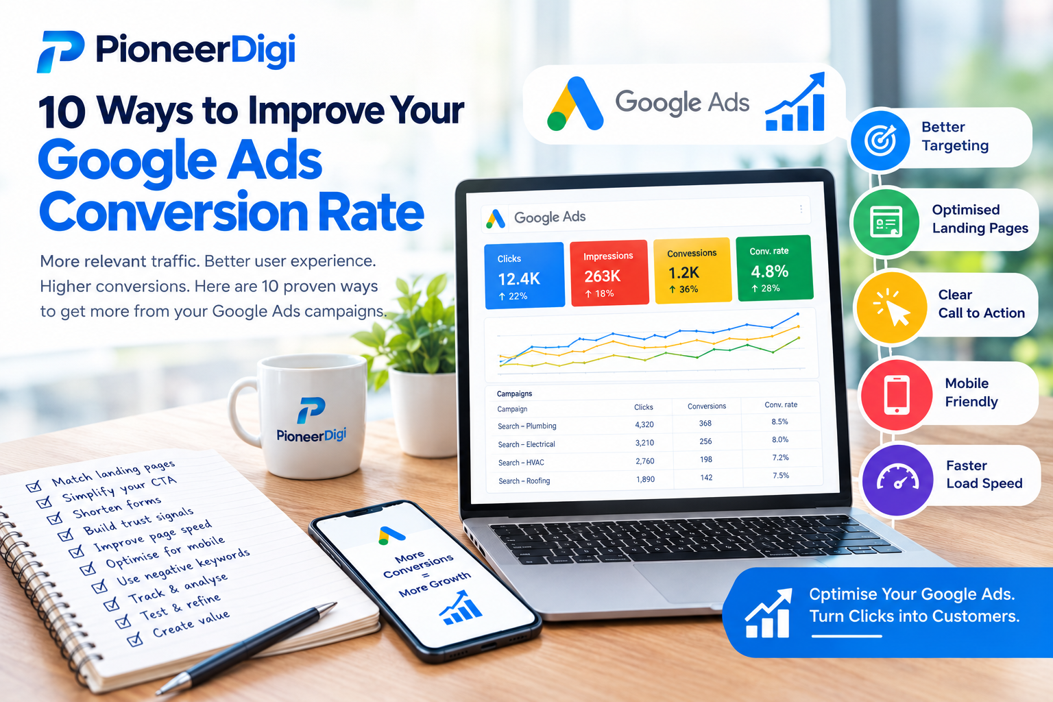
Conversion rate is the metric that quietly decides whether a Google Ads campaign is genuinely profitable or just generating traffic. Two campaigns can attract the exact same number of clicks at the exact same cost, yet produce completely different numbers of leads, purely based on what percentage of those visitors actually take action once they arrive. Improving conversion rate, even modestly, often has a far greater impact on overall results than trying to generate more clicks from an already-stretched budget.
The good news is that conversion rate isn’t governed by luck or industry alone — it responds directly to a series of specific, controllable factors across targeting, messaging, and page design. Below are ten proven ways to lift conversion rate, along with why each one works.
- Match Landing Pages Precisely to Ad Intent
A visitor who clicks an ad expects to land somewhere that clearly continues the conversation the ad started. When someone searches “same day hot water repair” and clicks an ad promising exactly that, arriving at a generic homepage listing ten unrelated services immediately breaks that expectation, often causing an instant exit.
Building dedicated landing pages that mirror the specific service, location, or offer mentioned in the ad — using consistent language, addressing the same need, and making the connection between search and solution immediately obvious — consistently produces higher conversion rates than routing all traffic to a single, general-purpose page.
- Simplify the Call to Action
Visitors often abandon a page not because they weren’t interested, but because it wasn’t immediately clear what to do next. Pages with multiple competing actions — several different buttons, a contact form buried deep in the page, a phone number in small print somewhere in the footer — create friction that a clearer page would avoid.
Reducing a landing page down to one obvious, prominent action — a single button, a clearly visible phone number, one short form — removes decision fatigue and makes it far easier for an interested visitor to actually follow through, rather than getting lost among competing options.
- Shorten and Simplify Forms
Every additional field on a contact form represents another small opportunity for a visitor to hesitate, get distracted, or abandon the process entirely. Forms that ask for more information than is genuinely needed at this stage — detailed project descriptions, unnecessary personal details, multiple confirmation steps — tend to see meaningfully lower completion rates than short, simple forms asking only for what’s essential to make first contact.
In most cases, a name, a phone number or email, and perhaps one brief field describing the enquiry is enough to begin a conversation. Additional details can always be gathered during the follow-up conversation rather than demanded upfront before a lead is even willing to submit the form.
- Add Visible Trust Signals
A cold click from someone unfamiliar with the business often comes with a degree of hesitation before they’re willing to hand over contact details. Visible, specific trust signals — genuine review counts and ratings, licence or certification numbers, years in operation, recognisable client logos, or clear physical location details — help reduce that hesitation by demonstrating credibility quickly, without requiring the visitor to search elsewhere for reassurance.
The specificity of these signals matters. A vague claim like “trusted by many customers” carries far less weight than a concrete, verifiable detail like “4.9 stars from 214 Google reviews” or “licensed and insured, servicing the area since 2009.”
- Improve Page Load Speed
A slow-loading landing page loses visitors before they even see the offer. Every additional second of load time increases the likelihood that an impatient visitor — particularly on mobile, where much of today’s traffic originates — simply leaves before the page finishes rendering, regardless of how compelling the content would have been.
Compressing images, minimising unnecessary scripts and plugins, and choosing lightweight, efficient page-building tools all contribute to faster load times. This is a technical detail that rarely gets attention until someone actually measures it, yet its impact on conversion rate can be substantial, particularly for mobile visitors arriving from a search on the go.
- Optimise Specifically for Mobile Visitors
A significant share of Google Ads traffic arrives via mobile devices, and a page that functions well on desktop can still create serious friction on a smaller screen — text too small to read comfortably, buttons difficult to tap accurately, forms that are awkward to complete with a mobile keyboard.
Testing the actual mobile experience directly — not just checking that a page “looks fine” on a phone, but genuinely attempting to complete the desired action from a mobile device — often reveals friction points invisible from a desktop review. Click-to-call buttons, in particular, deserve special attention for mobile visitors, since calling directly is often faster and easier than completing a form on a small screen.
- Write Ad Copy That Pre-Qualifies Visitors
Conversion rate isn’t only shaped by what happens after a click — it’s also influenced by who clicks in the first place. Ad copy that includes specific, clarifying details, such as service area, pricing range, or eligibility requirements, can discourage clicks from people who were never going to be a good fit, meaning the visitors who do click arrive with a clearer, more accurate expectation of what’s being offered.
While this can sometimes slightly reduce total click volume, it typically improves the quality of that smaller pool of visitors, since fewer of them are clicking based on a mismatched expectation that a more general ad might have created.
- Test Multiple Ad and Landing Page Variations
Assumptions about what will convert best are frequently wrong, even for experienced marketers. Running structured tests — comparing two or more versions of a headline, a call to action, or a landing page layout — allows real visitor behaviour to reveal which version actually performs better, rather than relying purely on intuition.
Meaningful differences in conversion rate often emerge from changes that seem relatively minor on the surface — a different headline framing, a repositioned form, a stronger opening statement addressing the visitor’s specific need directly. Testing consistently over time, rather than settling permanently on a single first version, uncovers these improvements progressively.
- Use Retargeting to Recover Visitors Who Didn’t Convert
Not every valuable visitor converts on their first visit. Some browse, compare options, and leave without taking action, particularly for higher-consideration purchases that naturally involve more than a single moment of research. Retargeting — showing ads specifically to people who’ve already visited the website — offers a second opportunity to convert these visitors, often at a lower cost than acquiring a completely new visitor.
Because retargeted visitors are already familiar with the business, conversion rates for this audience segment are frequently higher than for cold traffic encountering the business for the first time, making retargeting one of the more efficient ways to lift overall blended conversion rate across a campaign.
- Align Landing Page Content With the Specific Stage of Buyer Intent
Different keywords represent different stages of a buying journey, and a landing page that ignores this distinction often underperforms. A visitor searching a broad, early-stage research term has different needs and questions than one searching a highly specific, ready-to-buy term, yet many campaigns send both types of visitor to the exact same page.
Building slightly different landing page content — or at minimum, different messaging emphasis — for early-stage versus late-stage search intent allows each visitor to encounter content that matches where they actually are in their decision process, rather than a one-size-fits-all page that speaks effectively to neither group.
Bringing These Improvements Together
None of these ten changes need to happen simultaneously, and trying to implement all of them at once can make it difficult to identify which specific change actually drove an improvement. A more effective approach is to prioritise based on where the most obvious friction currently exists — a mismatched landing page, an overly long form, weak trust signals — implement changes methodically, and measure the resulting impact on conversion rate before moving to the next area.
Over time, these individually modest improvements compound. A landing page that converts a few percentage points better, combined with a shorter form, stronger trust signals, and better mobile optimisation, can meaningfully change the overall economics of a campaign — often turning a marginally profitable account into a genuinely strong one, without any increase in overall ad spend or traffic volume.
Final Thoughts
Conversion rate improvement is rarely about a single dramatic change. It’s the accumulation of specific, deliberate decisions — how closely a landing page matches ad intent, how simple the path to action is, how much trust the page establishes, how well it performs on mobile, and how precisely ad copy sets expectations before the click even happens.
Businesses that treat conversion rate as an ongoing area of active improvement, rather than a fixed outcome determined by industry or luck, consistently extract significantly more value from the same advertising spend than those who focus exclusively on generating more clicks without addressing what happens once visitors actually arrive.